Spiralcy.Studio Navigation Redesign
Random thoughts can be a good thing (sometimes)
As I was working on the studio’s first product, my mind wandered over to the studio website. I started to wonder what work I’d need to do so that I could add the first product page to the website. I originally did the design as a digital color study in red, but would this work for the products I’m planning for next year? One of them is a simple kids’ game. It uses pastel colors. I realized that I needed to better understand and clarify the visual language while working towards a more generic theme.
Revising the Navigation Menu
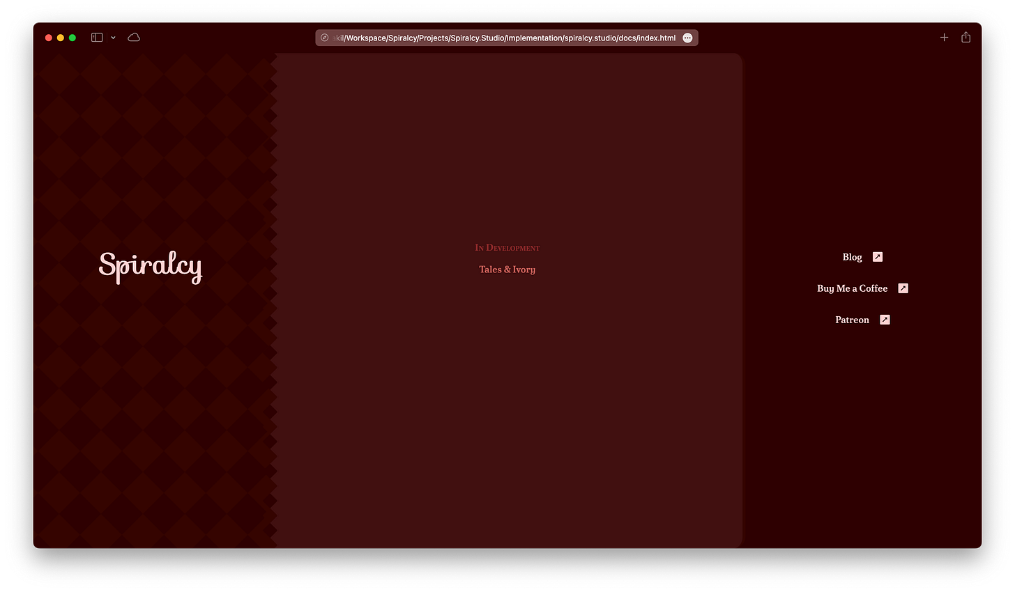
Today, I worked on a quick revision for the navigation menu, which is an area I’ve struggled with in this design. Before the update, the menu was placed on the right, but I initially thought I’d simply put the navigation links under the title. However, I needed to balance things out, so I designed the rightmost section. After deciding where to place it, I thought I’d just need to use a unique mix of motifs from the existing design to make it really stand on its own.
So with links placed and styled, each column/section in the old design had its own mix of color and font, distinguishing them from each other.
In the end, things fell into place… but it felt clunky.
Candidate Revision
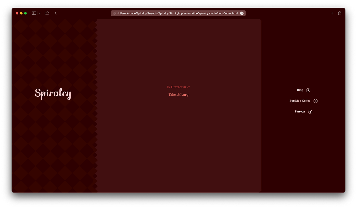
The thing that stood out the most to me was the filled in rounded square icon. It was just too heavy. Also, the square shape visually grouped with the diamond pattern on the left (background), but the link’s white text color grouped with the title (foreground). To break those relationships, I switched to a transparent circular icon.
This started to feel like a step in the right direction. Developing the icon was a bit unusual, but quick. I figured it would be a basic shape, so I decided to just write it in SVG.
<svg viewBox="0 0 20 20" width="20" height="20" xmlns="http://www.w3.org/2000/svg">
    <circle cx="50%" cy="50%" r="9" fill="#2e0000" stroke="#ffd3d3" />
    <path
        d="
            M 7 10
            H 13

            M 13 10
            L 11 7

            M 13 10
            L 11 13
        "
        stroke="#ffd3d3"
        stroke-width="2"
        stroke-linecap="round"
        stroke-linejoin="round"
    />
</svg>
This was the first time I had written the path element by hand, but specifying the path with turtle graphics was straightforward. (M moves the cursor, H draws a horizontal line, L draws a line)
Final Revision
After switching to a circular icon, it felt better, but something else became apparent. The icon didn’t really use the same line qualities as the serif font used by the text next to it (Półtawski Nowy). What could I do differently? Well, the font grouped with the text in the middle section, but the right sections’s colors all grouped with the leftmost section. Maybe I should just have the right section completely group with the leftmost section?
To do this, I matched the font to the title font, Sofia. I immediately felt that it looked better. An easy fix!
Release
The final release, Spiralcy 5.1, was merged and is now live at Spiralcy.Studio. As the links are not yet active, they’ve been grayed out.
Past this release, there are a couple big changes that will need to be done to reach Spiralcy 6. The studio page will be switched to grayscale, and will support light and dark modes. The diamond shape may change to a swirl.
After Spiralcy 6, the theme will be templated so that individual product pages can use its own base color and shape. The red/diamond combination used so far will likely be saved for the Tales & Ivory product page.


